IPD: From Workaround to Workflow
Overview
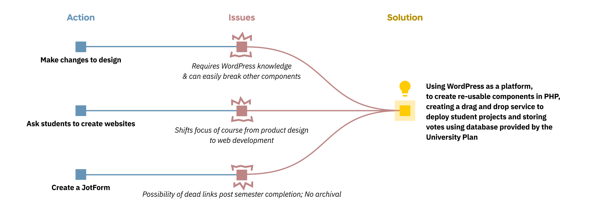
The University of Michigan's Integrated Product Development course ships ~7 student-built products to a public launch event every semester. The site, that could supposedly host those launches, was a hardcoded WordPress with a list of JotForm links pointing to wherever each student team happened to host their own site. When a semester ended, the form locked, the links went stale, and years of student work quietly disappeared.On the other hand, in-person voting ran on paper slips collected and counted by hand. This process was disconnected, and it was shifting the essence of the course from "build a product" to "build a product page" for students who had no web experience and "count votes" for staff instead of giving immediate feedback on the products themselves.Learn more about how I redesigned the website to improve the experience for students, staff and voters.
Jump to Solution
Role
UX Engineer
I owned the audit, the redesign, the design system, the WordPress build, and the deployment. I also identified and closed a workflow gap for efficiency.
Timeline
June 2025 – October 2025 (4 months)
Team
Me
UX Engineer
Skills
Information Architecture, Design Systems, WordPress / PHP, Stakeholder Interviewing, Deployment
My Contributions
As a UX Engineer, I...
- Audited and analyzed the existing site, workflows and ran two informal tests with peers
- Developed a design system focusing on a merged University of Michigan and IPD branding
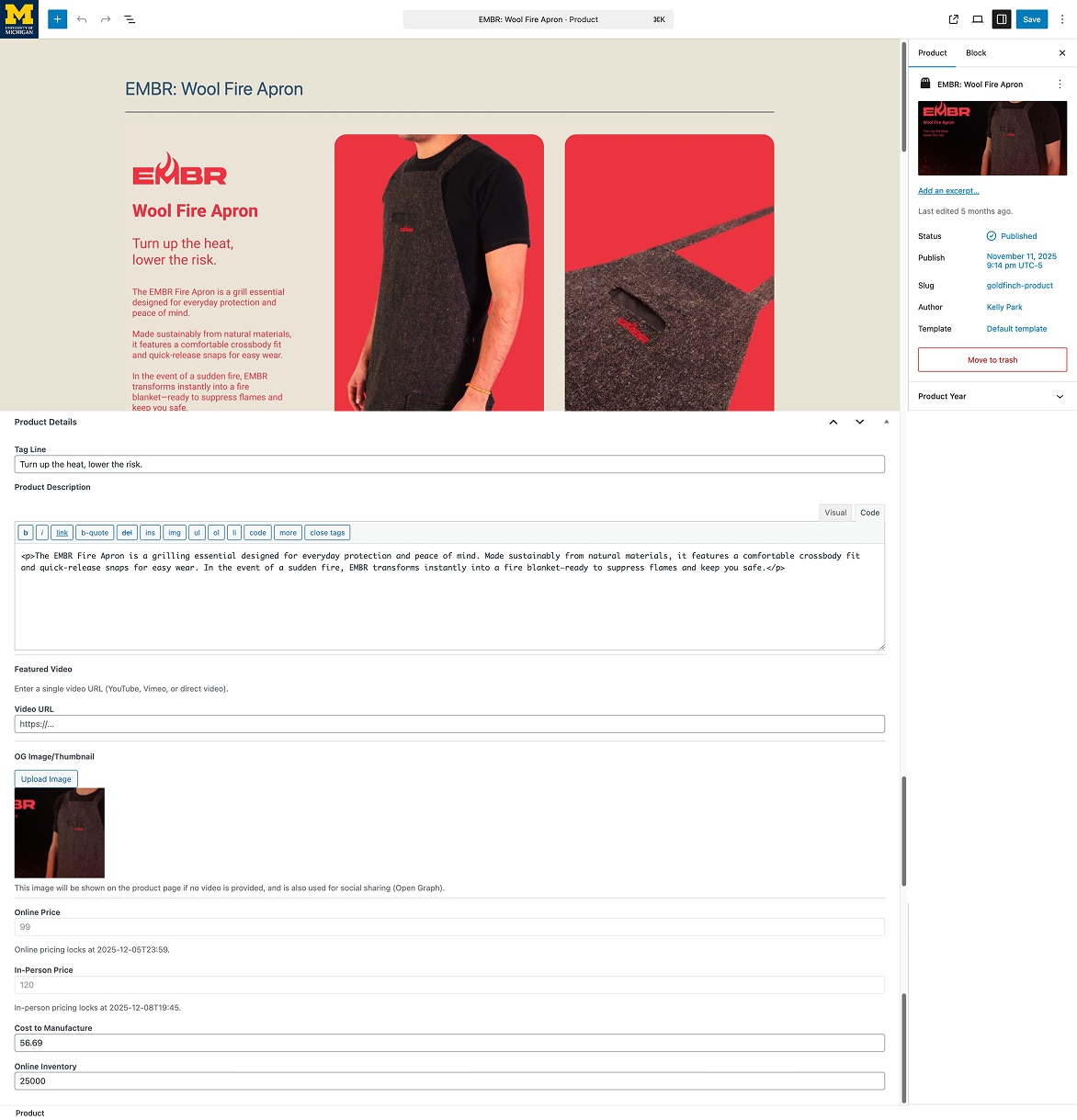
- Used Figma MCP and GitHub Copilot to translate design ideas directly into working PHP components
- Built 40+ reusable components and 3 page templates for WordPress
- Authored a custom "Project Contributor" user role that scopes content access per team
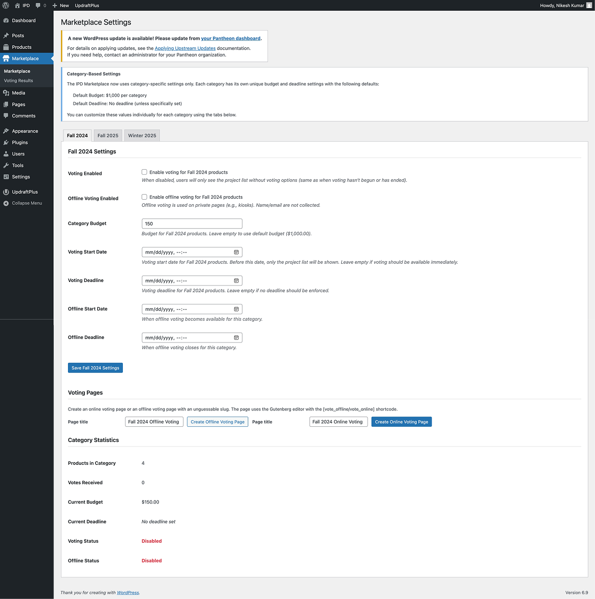
- Built a Marketplace tab to control voting, configure rules, and report results live across semesters
Outcome / Impact
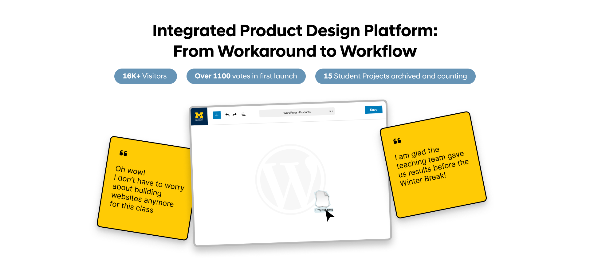
16K+
visits during the course-selection window, first cycle with permanent semester archives
800+
in-person votes cast at kiosks that were previously counted by hand from paper slips
3 → 1
tools collapsed into a single voting workflow (JotForm + paper ballots + spreadsheet → unified Marketplace)
Background
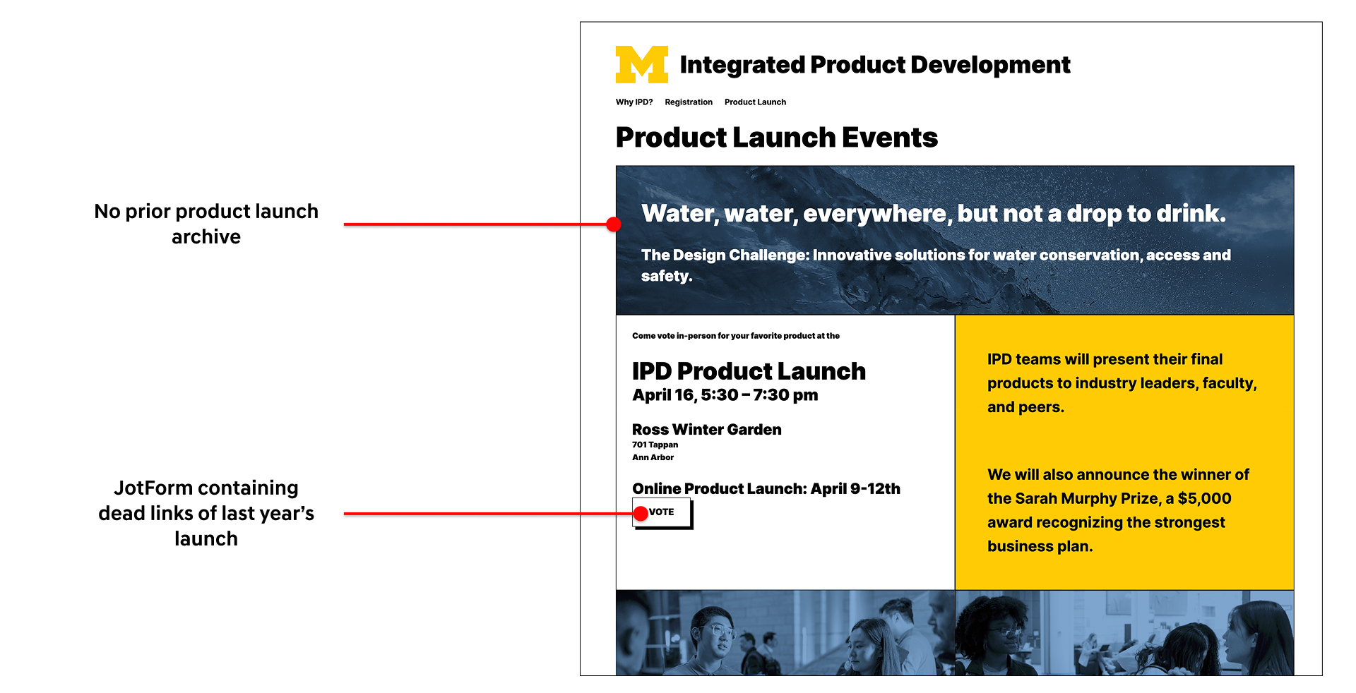
IPD is a 6-credit, five months interdisciplinary course at U-M (University of Michigan) where students from Art & Design, Business, Engineering, and Information form companies, build a product, and pitch it at two competitive launches: 1 online, 1 in-person; where attendees get a mock budget to buy their favorites. (I was a student in this course the year before, which is how Lumicharge came to be)Before this project, the launch looked like was a page of JotForm links, each pointing to wherever a student team happened to host their own site. Visitors would vote through the form with a fixed budget. When the semester ended, the form locked. If a team's hosting lapsed, the link went dead. There was no archival, leading to a graveyard of broken URLs where prior years' work used to be. Moreover, when a new semester launched, old form is removed so past work was lost in the transition.
In-person voting ran on paper slips. Attendees filled them out by hand; the teaching team counted them manually after the event, which meant longer turnaround for results and no live view of the voting trends. This process was disconnected from the online voting, faced an issue of duplicate votes and was time consuming for the staff as they raced against the finishing semester to tally results and provide feedback to the students.
Objective

1. A cohesive design system
The site needed to incorporate U-M's brand without losing the IPD identity.2. A WordPress site built for content management
This meant restructuring the site so that the visual and the content were separate. That would allow the staff to make use of versioning, scheduling and the platform effectively as a CMS, instead of a hardcoded site.3. Ability to create projects within the system
Allow authoring so each new team could ship a product page without learning web development.Audit & Analysis
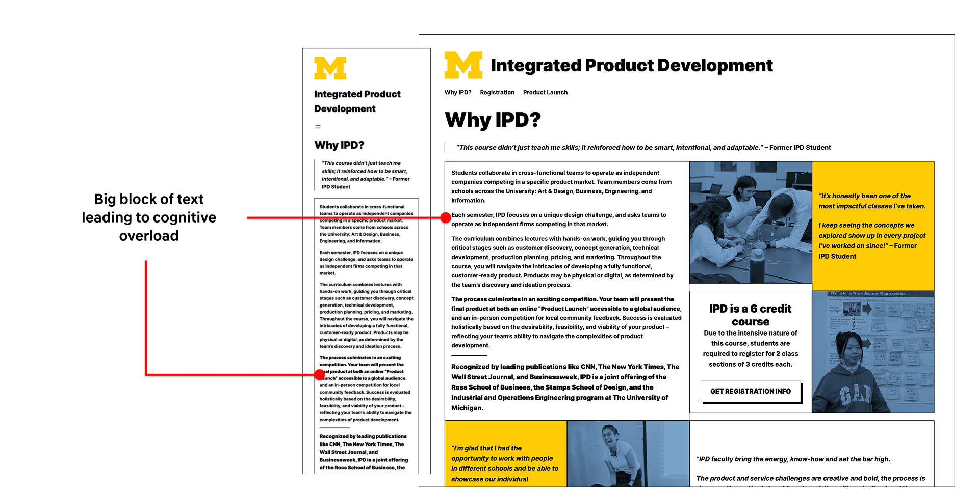
The first thing I did was sit with the existing site, analyze the responsiveness, accessibility, consistency and then map the workflow the staff. With two peers who had never seen the site before, I ran an informal test, asking them to figure out what the course was and describe their thought process as they explored. The results were as I had expected, the information was there, but it overwhelmed them, confusing them with too much to parse.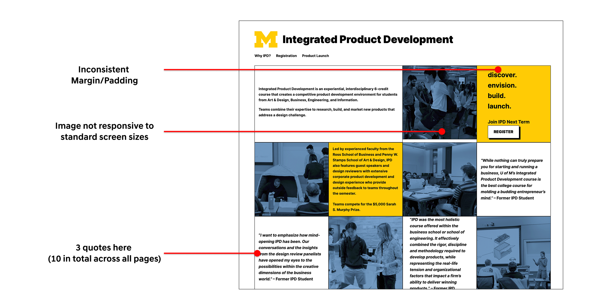
Design
As I was designing, I included the instructor team in my feedback process, however, the team wasn't aligned with itself. Different stakeholders wanted different sites. One in particular had strong, specific opinions and preferred to view incremental design decisions that is "0 → 10 → 20, not 0 → 20." In response, I started shipping in smaller, reviewable steps rather than presenting big jumps. Over the next few weeks, I noticed her feedback was the feedback that kept landing and she was the primary stakeholder. That insight changed how I worked. Instead of optimizing for consensus across all voices, I designed primarily for her vision and validated edges with the rest of the team. This made design iterations faster and made the feedback very actionable.Information Architecture
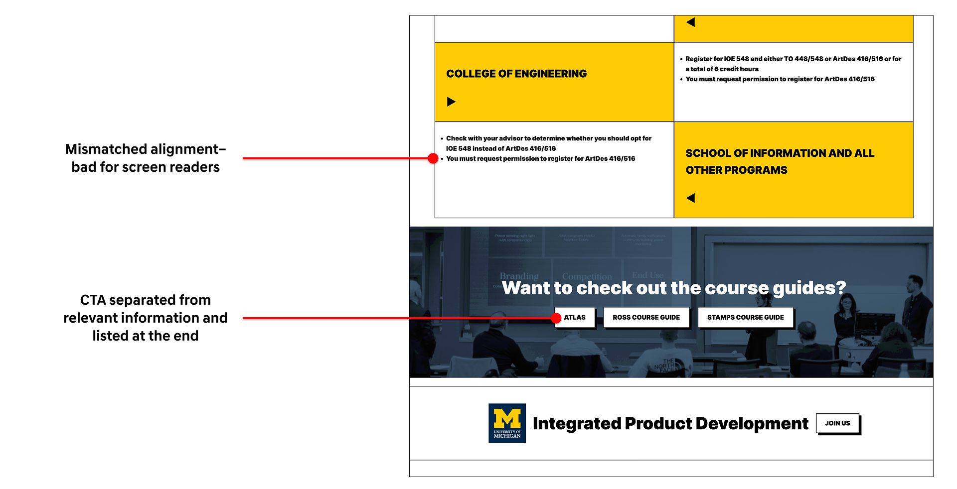
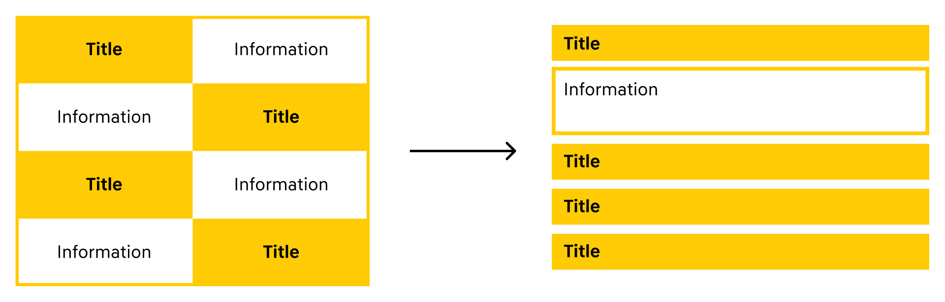
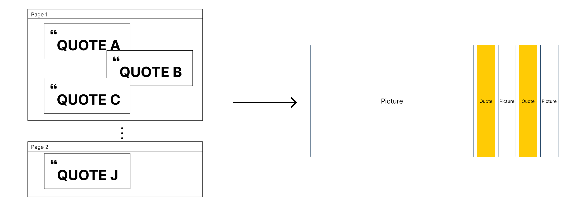
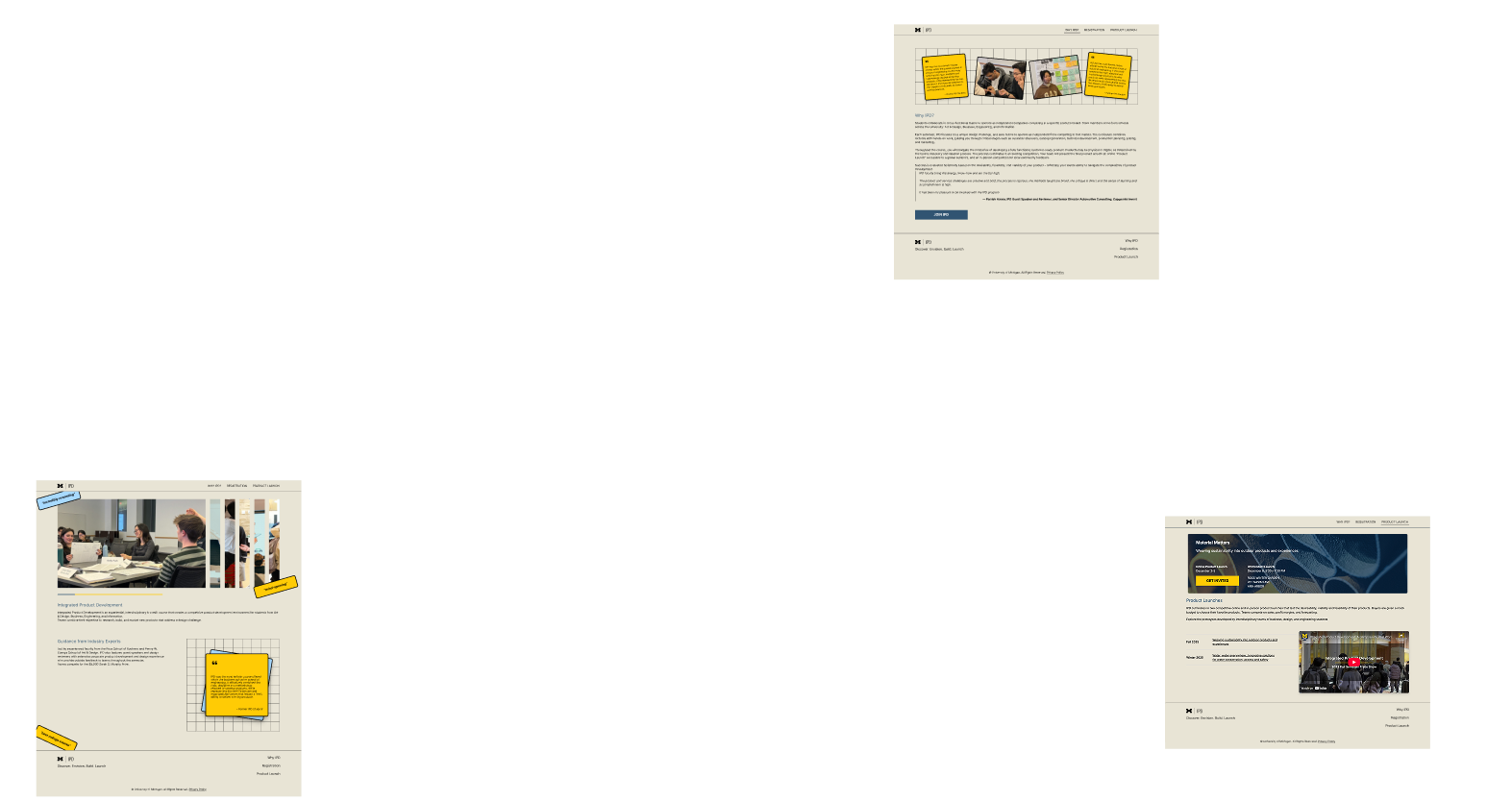
As my informal tests revealed, the original site had overwhelming amount of information. My goal was to simplify the information architecture, ensure it doesn't break when excess information is added over the years and make it easy for staff to manage the content. The first and foremost thing I identified was the presence of excessive number of quotes, which however insightful, could shadow other important information. So my design decision was to limit quotes to one section and make it visually stand out.The other important page for students was the registration page, which invited lots of visitors on whether to take the course. This page had accessibility issues and the content was overwhelming, to which I used accordions to compact content and only show relevant information to the user.
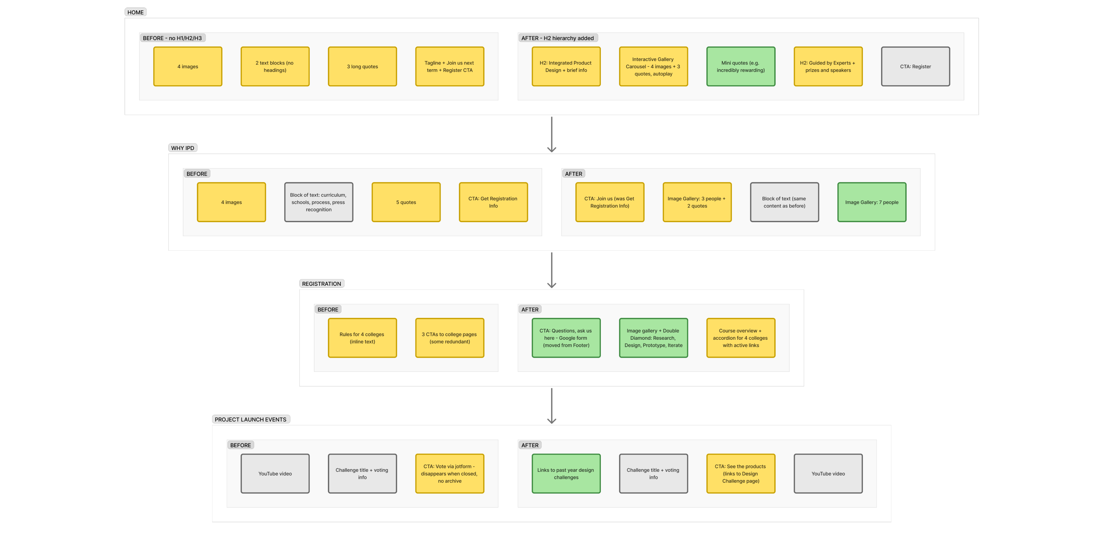
Solution & Design Considerations
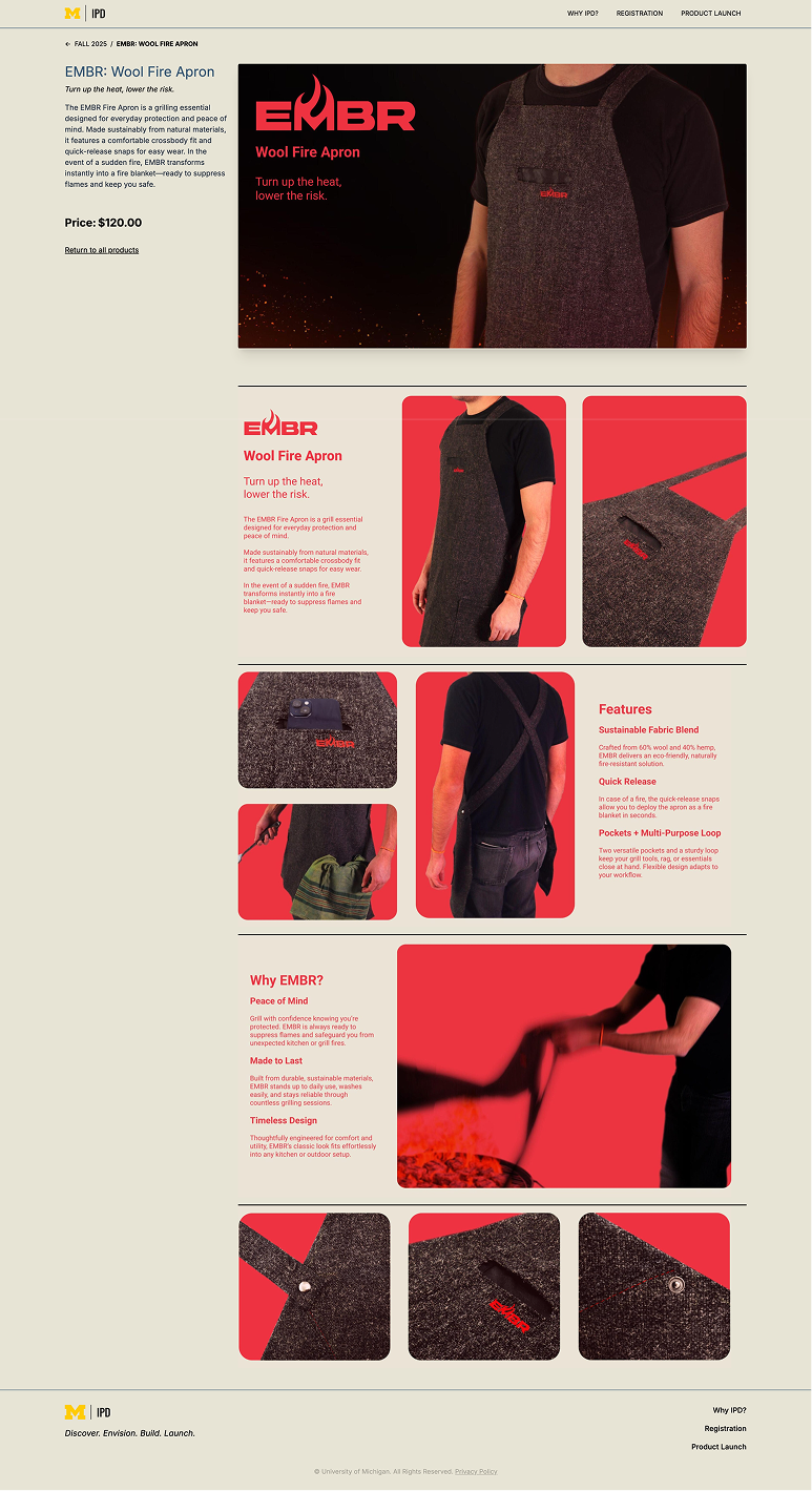
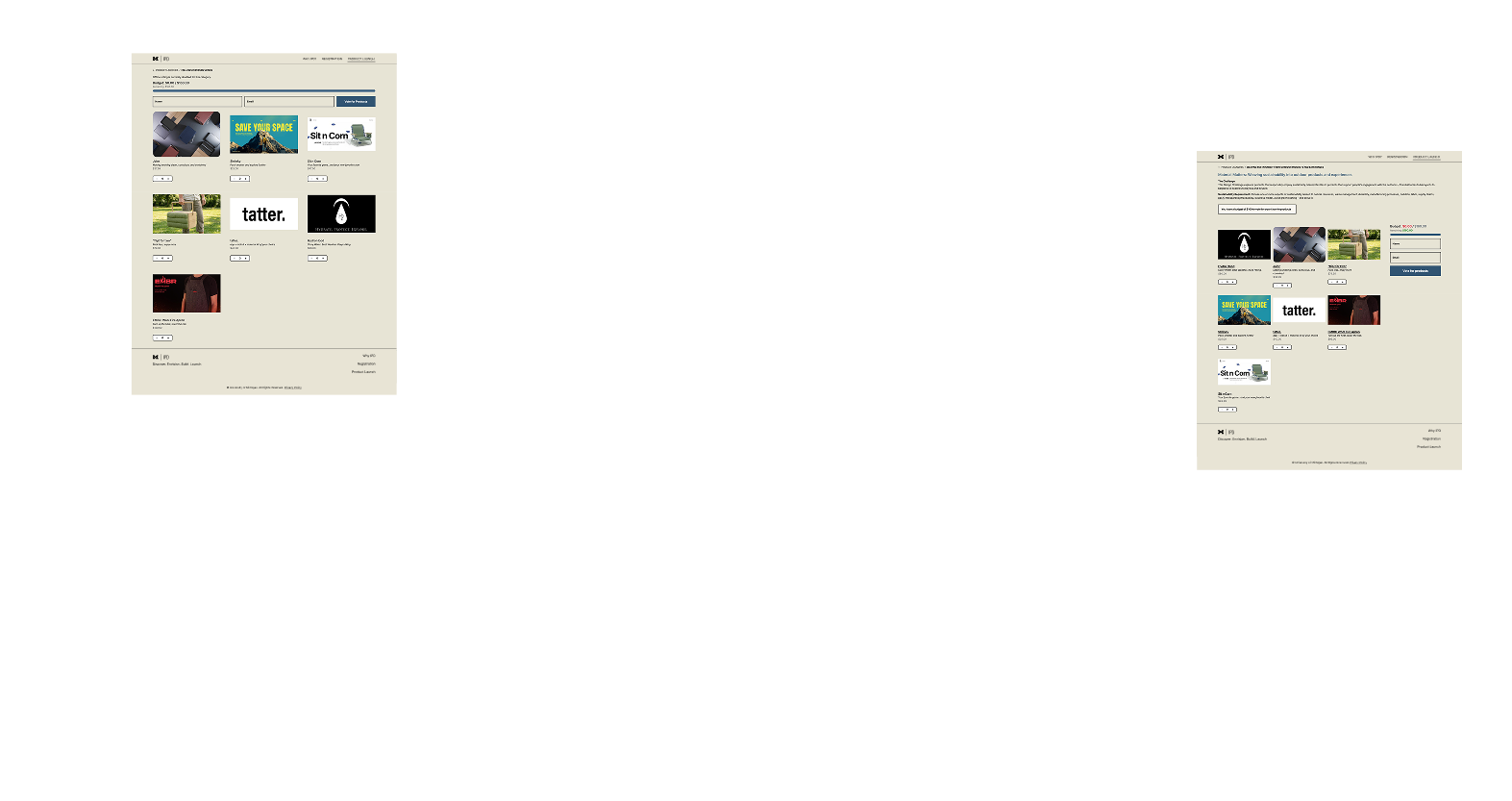
By September, I rebuilt the site, deployed and ready to be used by the teaching staff and students without my involvement. Let's explore the system from each user's perspective.For the students
While the stakeholders are the primary concern, the students are the end users. Current platform shifts focus from building a product from end-to-end to building a product page and marketing it for the latter part of the course, which is not the learning experience this course aims to provide. My design solution was to:- Create a project contributor role that allows students to log in and edit only their project page.
- A simple drag and drop interface to upload assets requiring no extra technical knowledge or tools. This allows students to use their branding assets directly on the product page, where storytelling is a key part of the learning experience.
For the staff
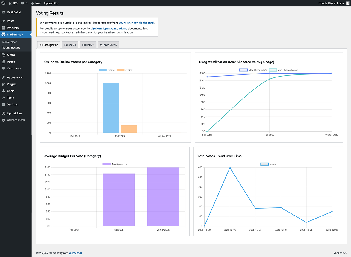
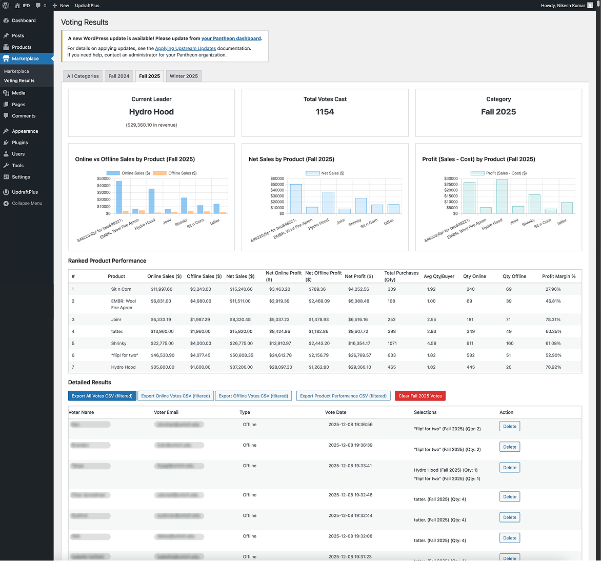
Moving to the primary workflow updates, the staff had to manage launches and voting across two platforms: JotForm for online and paper ballots for in-person. This was a lot of overhead, and it also meant that the in-person votes were not captured in the same system as online, which was a problem for reporting and archiving. My solution aimed to:- Create a marketplace tab which recorded user votes across both online and in-person, with details such as user's name, email, voting time and votes cast. This allowed removal of repeated votes.
- Provide a live view of voting trends, show budget utilization. This allowed staff to provide real-time feedback to students during the in-person launch and also make informed decisions on how to allocate the budget for the next cycle.
- Automatically archive launches and block voting after the end of the voting window. This allowed the staff to focus on the current semester and not worry about manually archiving or removing old launches.
- To ensure there is not bias in voting, the products where shuffled on refresh to ensure they are not always in the same order.
The Real Constraint
Before I get to launch, the honest part. I had limited freedom on visual design, every exploration I made was returned with the same direction: evolve it from the existing course poster. Posters and websites are different mediums solving different problems, and being asked to derive web design from print collateral pulled the work toward a ceiling I couldn't push past.I made peace with it by treating the poster as a brand input rather than a design source, pulling the palette and a few motifs, but building the actual web design system on web-native principles. Not every project lets you start from a clean canvas, and the work is to figure out ways to work within constraints and pitch the value of design decisions to stakeholders.Launch & Aftermath


The site went live for the December 2025 launch. The numbers:
1,100+
total users on launch day
800+
in-person ballots first time captured in the same system as online
16K+
visits during the course-selection window
The Outage I Couldn't Reproduce
Here's the part I'm not going to gloss over: during the launch window, the site went down intermittently. No log records, no reproducible trigger, no pattern in the timing. I debugged the server resources, plugin conflicts, database locks, in order to replicate the issue and none of it matched the symptom. I never reproduced it.I later also recommended connecting Microsoft Clarity to the site for real session replay, which would have caught the user-facing impact even when the server logs were empty. Shipped systems fail in ways the staging environment doesn't predict and the best you can do is to have monitoring in place to catch the user-facing symptoms and iterate from there.